Overview
A page-by-page, card-by-card answer to the questions clients actually ask. Can we rename that? Can we hide that number? Can it be our green instead of yours? How long will it take?
Written for client success. No code, no file paths. If you need the technical detail behind any line here, engineering has it.
Screenshots are the real product at phone size with sample data. The numbers are fake, the layout and typography are not.
Pages
| Page | Status |
|---|---|
| Holdings / Positions | Drafted. Review this one first and tell me if the format works. |
| Dashboard | Not started |
| Holdings Detail | Not started |
| Transactions | Not started |
| Accounts Summary | Not started |
| Documents | Not started |
| Net Worth | Not started |
| Profile Settings | Not started |
How to read the effort column
Every page doc rates each change one of three ways. That rating is the part you can quote in a client call.
| Rating | What it means | Rough turnaround |
|---|---|---|
| Config g>Config | A settings change for that one client. No code touched. | Same day, plus release timing |
| Branding Branding | A theme change: colors, fonts, corner rounding. Needs a developer and a build. | Days, scoped as branding work |
| Product >Product | Not a per-client setting. Changing it changes it for every client on IC Mobile. | Roadmap conversation, not a config request |
The Product rating is the one worth internalising. It does not mean no. It means the ask goes to the roadmap, gets prioritised against everyone else's asks, and lands for all tenants at once. Promising a Product-rated change as a quick configuration tweak is the most common way these conversations go wrong.
Five kinds of change, in plain terms
Each page doc walks the same five questions for every card on screen.
1. Can we hide the whole card or the whole page? 2. Which pieces of information show, and in what order? 3. What do the labels say? 4. How do the numbers and dates look? Dollar signs, decimals, negatives, blanks. 5. What colors and fonts does it use?
There is a sixth question that only comes up on data-heavy pages: which records the page pulls in. Filtering out asset types a client does not custody, for instance, is a Config change and comes up often.
Each section ends with a short "cannot change" list. That list is the useful half of the document. It is what keeps a client call from ending in a commitment nobody can keep.
Three things to know before any client conversation
Some settings are shared across clients, some are per client. Number formatting is the big one. Turning on the dollar sign is a Config change, but it applies to every dollar amount in that client's app, not just the one card being discussed. If a client wants the symbol in one place and not another, that is a Product change.
Some cards appear on more than one page. The summary card at the top of Positions also appears on Account Details. Hiding a field on one can hide it on both. Engineering can scope it to a single page, but flag the question rather than assuming.
Hiding something is a display change, not a security control. If a client asks us to hide a field for a particular user role, we can. It stops that field appearing on screen. It is not a data-access restriction, and it should never be described to a client as one. Access control is a separate conversation with a different team.
A note on the screenshots
The bar at the top of the screen and the tab bar at the bottom are drawn by the native iOS and Android app, not by the web content in between. What you see in these screenshots is a stand-in used during development. Layout and labels are right; exact pixel rendering on a real device differs slightly.
Regenerating the screenshots takes a few minutes and needs a developer. The instructions are in tooling/.
Holdings / Positions
The list of what a client holds, with a total at the top.
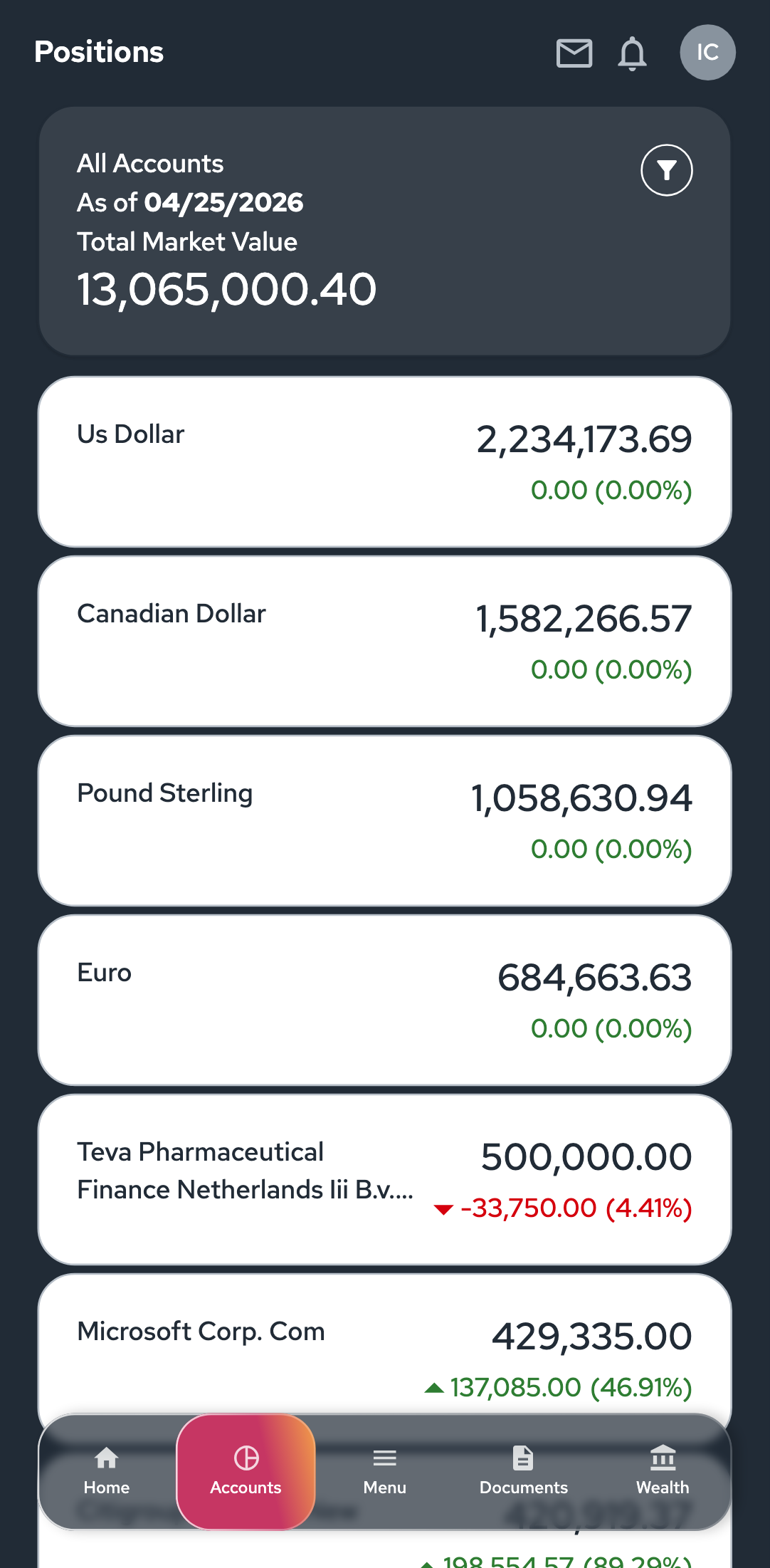
Note the page is called Positions, not Holdings, in the shipped default. Some clients rename it. Check which name a given client uses before writing anything client-facing.
Seven things on this screen:
| Element | Who owns it | |
|---|---|---|
| A | Title bar at the top | The native app |
| B | Alert banner | Content team via the CMS |
| C | Summary card | Shared across pages |
| D | Position rows | Shared across pages |
| E | Filter panel | This page only |
| F | Tab bar at the bottom | The native app |
| G | Footer | Content team via the CMS |
C and D also appear on other pages. See the note in each section.
Turning the whole page off
Config. A client can have IC Mobile without a Positions page. Switching it off removes the page, its menu entry, and the tab destination that leads to it, all at once. There is no half-measure that keeps the page reachable but hides the menu link.
It can also be switched off for one type of user while staying on for others. A prospect who has not funded an account, for example, can be given an app with no Positions page while funded clients keep it.
A. Title bar

| The ask | Rating | Notes |
|---|---|---|
| Rename the page | Config | This is where Positions becomes Holdings, or anything else |
| Remove the envelope icon | Config | It follows whether the client has messaging turned on |
| Remove the bell icon | Config | Follows whether notifications are turned on |
| Change the user initials circle | Product | Comes from the user's own profile |
| Reorder or restyle the icons | Product |
Cannot change: bar height, title alignment, which icons are available.
B. Alert banner
The wording, urgency and dismissibility all come from the content management system, so the content team authors this per client. There is no engineering involvement in changing the message.
| The ask | Rating | Notes |
|---|---|---|
| Change the wording | Content team | Not an engineering request |
| Turn alerts off entirely | Config | The same switch also controls the footer and disclaimers. There is no alerts-only switch. |
C. Summary card
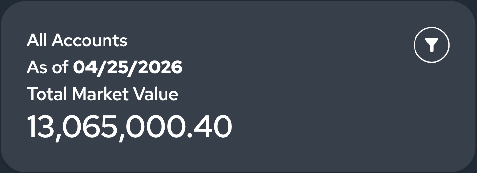
Also appears on Account Details. Hiding a field here may hide it there too. Engineering can scope a change to Positions only, but the request has to say so.
What shows
Three things, all on by default: the account name, the total, and the as-of date.
| The ask | Rating |
|---|---|
| Hide the account name | Config |
| Hide the as-of date | Config |
| Hide the total | Config |
| Reorder the three | Config |
| Add a fourth piece of information | Product |
Wording
Config. Every label on this card can be reworded per client. "Total Market Value" is the default, and clients rename it to Portfolio Value, Total Assets and similar, routinely.
How the numbers look
The total shows as 13,065,000.40 by default. No dollar sign. That is deliberate, not an oversight, and it is the single most common thing a client notices in their first review.
| The ask | Rating | Notes |
|---|---|---|
| Add the dollar sign | Config | Applies to every dollar amount in the app, not just this card |
| Use a different currency | Config | Same caveat |
| Drop the decimals | Config | Same caveat |
| Show negatives in brackets instead of with a minus | Config | Same caveat |
| Change what blanks look like | Config | Dash, long dash, or nothing at all |
| Change the date format | Config | Day-month-year, spelled-out month, and so on |
Read the caveat column carefully. These are formatting rules for the whole app. If a client wants the dollar sign on this card but not on the rows below it, that is a Product change.
Both Evoke and Neuberger Berman turn the dollar sign on, so a client asking for it is asking for something two other tenants already have.
Colors and fonts
| The ask | Rating |
|---|---|
| Card background and text color | Branding |
| Corner rounding | Branding |
| Typeface | Branding |
| Make the big number bigger | Branding and more work than it sounds |
That last row is worth flagging early. Text sizes on this card are not part of the normal theme, so resizing one is a hand-written style rule for that client rather than a setting someone flips. It is doable. Price it as development work, not branding polish.
Which records feed it
Config. The total can be narrowed, most commonly to exclude asset types the client does not custody. FIS AddVantage does this today.
Cannot change: the card holds three slots and no more, the filter button sits top right, the card spacing, and the placeholder shown while data loads.
D. Position rows
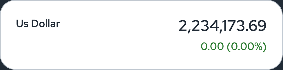

Shared with other holdings lists in the app.
What shows
Three things per row, all on by default: the security name, the market value, and the gain or loss with its percentage.
| The ask | Rating | Notes |
|---|---|---|
| Hide the gain/loss | Config | Removes the arrow, the amount and the percentage together |
| Hide the amount but keep the percentage | Product | The three parts are one unit |
| Hide the market value | Config | |
| Add a ticker, or any fourth column | Product | |
| Change the sort order | Product | Sorted by value, largest first, on the server |
Wording
There is nothing to reword. The rows show values only, no labels. The security name is whatever the custodian data returns.
How the numbers look
The market value follows the same app-wide currency rules as the summary card above. Two differences worth knowing:
- Gains carry an explicit plus sign. The summary total does not.
- The percentage in brackets can go to one decimal place as a Config change, but it applies everywhere that style of percentage appears.
Colors and fonts
| The ask | Rating |
|---|---|
| Green for gains, red for losses, in the client's own shades | Branding and straightforward |
| Card background and rounding | Branding |
| Larger or smaller value text | Branding hand-written rule, same caveat as the summary card |
| Show the full security name instead of clipping to two lines | Branding hand-written rule |
| Move the gain/loss onto its own line | Product |
Which records feed it
Config. This is the lever that comes up most on this page. Clients regularly want property, art, vehicles, insurance and loans stripped out of the Positions list, and that is a settings change per client. FIS AddVantage excludes exactly that set today. Evoke narrows the list to held positions only.
Cannot change: row height, the name-left value-right layout, tapping a row to open its detail, and how many rows load at a time as the user scrolls.
E. Filter panel
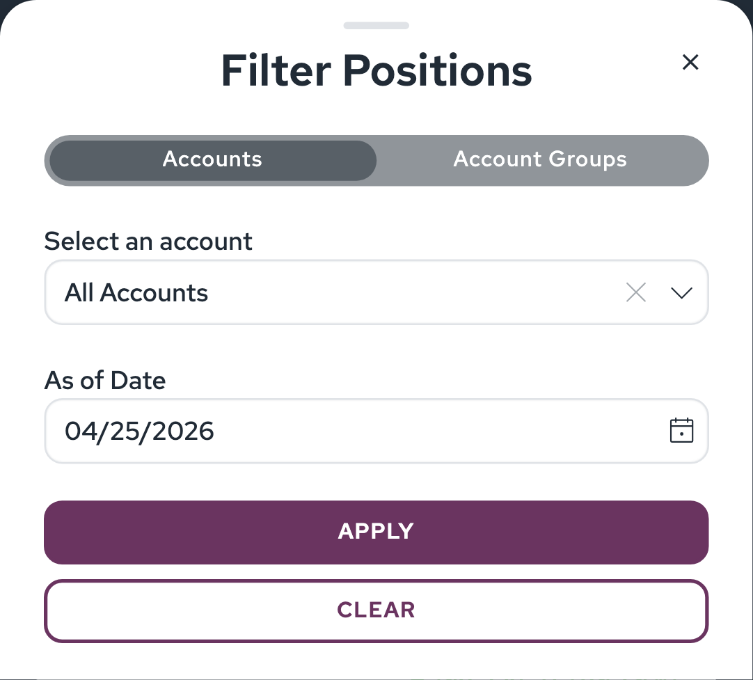
Which tabs appear
Two by default: Accounts and Account Groups. A third, Portfolios, appears for clients using the three-level account hierarchy.
| The ask | Rating | Notes |
|---|---|---|
| Remove the Accounts tab, leaving groups only | Config | Can be done on this page without affecting other filters |
| Add the Portfolios tab | Config | Comes as part of the three-level hierarchy setting |
| Rename any tab | Config |
One trap here. Switching on the three-level hierarchy does not simply add a third tab. It also shifts what the first two tabs mean, so the tab labelled Accounts starts showing account groups. If a client asks about this, involve engineering before describing the result.
Forcing a selection
Config. By default the filter offers All Accounts, and the page opens showing everything combined. A client can require the user to pick a specific account instead, in which case the combined view never appears.
Wording
Config for the panel title, the tab names, the As of Date label, and the Apply and Clear buttons.
One caveat on the dropdown labels, "Select an account" and "All Accounts". Those two come from a shared set of wording rather than this page's own, so renaming them renames them everywhere the same dropdown appears. There is also a lookalike setting on this page that appears to control them and does nothing. Engineering knows about it. Just treat a rename request here as needing a five-minute check rather than an immediate yes.
Account numbers in the dropdown
Config. How much of an account number is masked, and what character does the masking, is adjustable within limits. A client cannot configure the masking away entirely.
Colors
Branding for the Apply and Clear button fills, button rounding, the tab pill styling and the panel background.
Cannot change: which fields the panel contains and in what order, the date picker's ceiling of today, the Apply-above-Clear button order, and the panel sliding up from the bottom.
F. Tab bar

Drawn by the native app, driven by settings.
| The ask | Rating | Notes |
|---|---|---|
| Which tabs appear, and in what order | Config | |
| Rename a tab | Config | |
| Change a tab's icon | Config | Chosen from a fixed set of ten. A custom icon is Product. |
| Change where a tab lands | Config | This also decides whether a back arrow appears on that page |
| Different tabs for different user types | Config |
Cannot change: bar height, the highlight styling on the active tab, icon size, label styling.
G. Footer
Visible at the bottom of the full-length screenshot.

Copyright, links and disclaimer text are authored per client in the content management system, so this is a content team request rather than an engineering one. Turning the footer off entirely is Config, and it shares a switch with the alert banner and disclaimers.
Quick reference
The asks that come up most, and what to say.
| Client asks for | Say |
|---|---|
| "Call it Holdings, not Positions" | Yes. Config. |
| "We want the dollar sign" | Yes. Config. Note it applies app-wide. |
| "Drop the gain/loss column" | Yes. Config. |
| "Negatives in brackets" | Yes. Config. App-wide. |
| "Percentages to one decimal" | Yes. Config. App-wide. |
| "Only show what we custody" | Yes. Config. We need the list of what to exclude. |
| "Make the user pick an account first" | Yes. Config. |
| "Our brand colors" | Yes. Branding, scoped as a piece of work. |
| "Gains in blue instead of green" | Yes. Branding, quick. |
| "Make the total bigger" | Yes, but it is development work. Set expectations. |
| "Add a ticker column" | Roadmap. It would land for every client. |
| "Sort alphabetically" | Roadmap. Sorting is server-side. |
| "Gain/loss on its own line" | Roadmap |
| "Dollar sign in one place but not another" | Roadmap. Formatting is app-wide by design. |